
A Mid-Fi Tale:
Improving Walden Pond Books' eCommerce
Improving Walden Pond Books' eCommerce
Research, ideation, design, prototyping
Self-directed case study, General Assembly UX Immersive, 2021
Methods Used
User interviews, affinity map, user persona, problem statement, how might we, ideation sessions, comparative analysis, card sort, user journey, user flow, and site map.
Challenge
Founded in 1973, Walden Pond Books is one of the largest independent bookstores in Oakland and a staple in the community. “The highest priority will always be given to the face-to-face contact we have with our customers. A year ago, we saw an opportunity to support the local community and keep our business going through COVID by allowing people to order some products online. We built our own website but we’re not pleased with the results. We have plenty of website visitors yet few completed purchases.
Through an improved eCommerce website, we want to showcase our products while maintaining our brand image: “small shop” appeal and great customer service."
Solution
Updated eCommerce store to better showcase and organize their products while maintaining local business vibe.
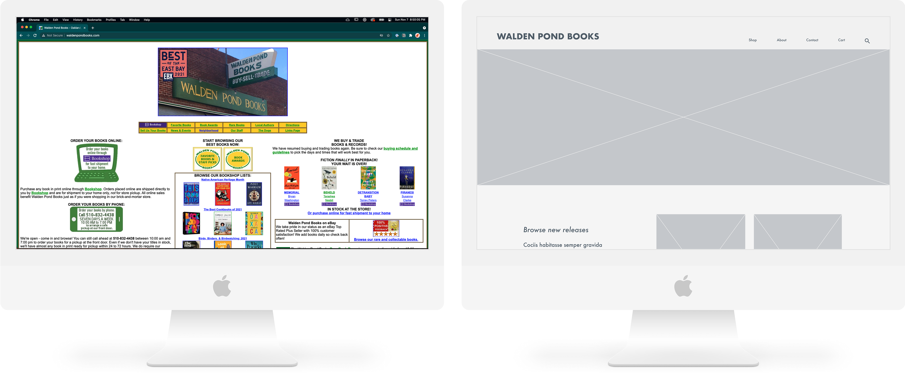
Before vs After (Mid-fi prototype)
Research
Site Audit
Overwhelming Content
Between the sheer volume of books, copy, CTA buttons and links I had a really hard time figuring out where my eye should land in the long run. I quickly browsed other tabs and found the same issue: as interesting as everything was I was inundated with walls of copy that I ended up just lightly skimming and clicking away. This is a huge problem when it comes to converting views to a purchase.
Confusing Information ArchitectureThe global navigation that we're faced with off the bat is a mixture of a third-party platform to purchase their books, different tabs to browse said books, local authors, and "The Dogs" among other things. As much as I love animals, if I can easily find the employee pet page quicker than I can find a book that I want, that's probably something that should be reconsidered.
Disconnected Purchasing Platform
Clicking through flow, it brings you to a third-party platform which is not only disruptive to the user experience but Walden Pond Books could potentially lose out on revenue because you're quite literally being directed away from the business's page that you're trying to support. While Bookshop.org is well-intentioned, one can a purchase a book from them without even selecting a specific bookstore to support.
Misaligned Look and Feel
Having been to their brick and mortar and instantly feeling a sense of wonder, curiosity, and an urge to purchase as much as I can physically carry, the website gives off a very different vibe. It's time to align the two more closely.
Card Sort
To better understand how users expected to navigate the current site, I recruited some participants for a closed card sort. Between this and a comparative study of other location businesses, this information was pertinent to the re-vamp of the site map, as shown below.
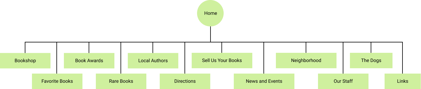
Current site map

Updated site map
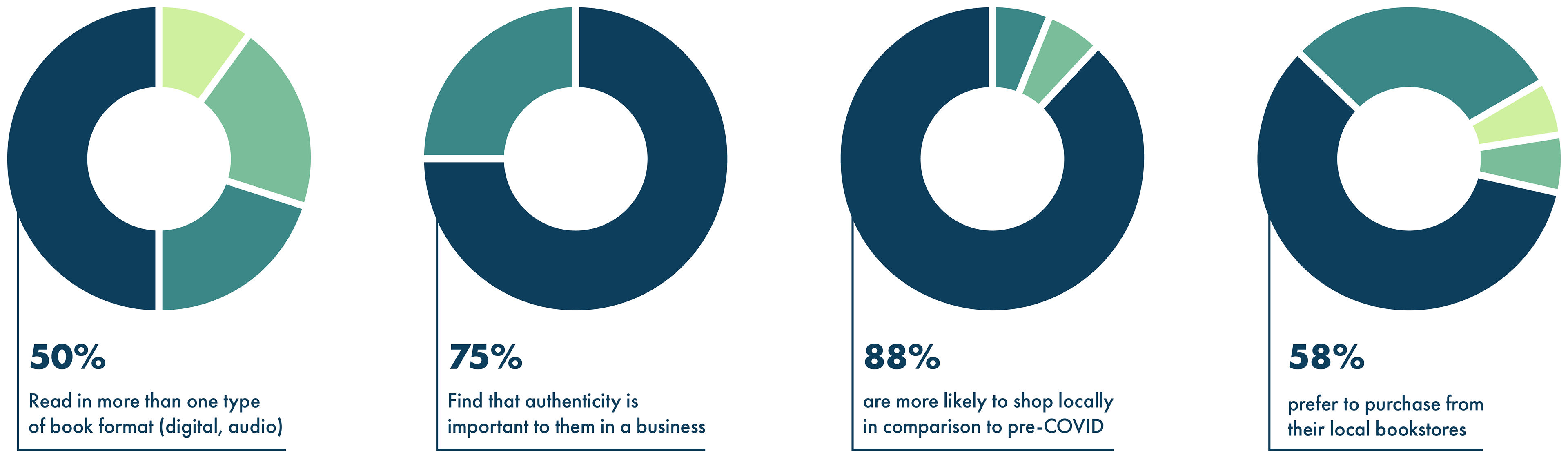
User Research
My high-level goal was to get better insight into people's purchasing and reading habits, so I formulated questions for my user interviews and surveys. From that I synthesized the data into an affinity map, key insight in this stage included:
Define
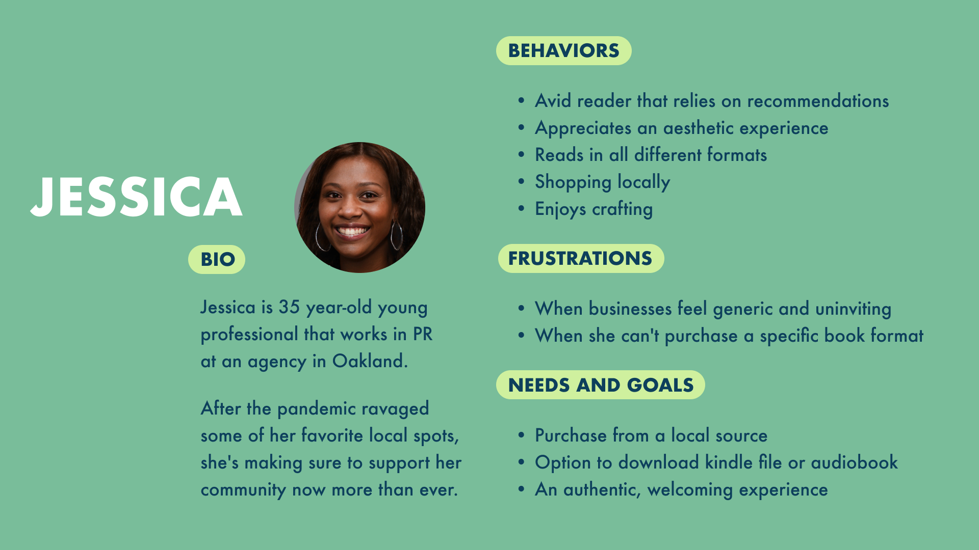
User Persona
The synthesized data from my user interviews helped flesh out my user persona: Jessica. This information would help to formulate my problem statement: Jessica needs an authentic experience to read and buy books in different formats so that she can support her local bookstore. As well as my how might we: How might we help Jessica find her new favorite books more easily?
Ideate
Based on the ideation sessions, I implemented two features into my mid-fidelity prototype that participants found important: a book-rating system that was upfront and a filter that included well-known book lists. 100% of the participants were able to apply a filter, find a book in a format that worked for them, and complete their checkout process in under 3 minutes. Feel free to poke around in the mid-fi below!
Next Steps & Reflections
The biggest lesson here was catching myself designing for what I wanted to see instead of what people actually needed. A few of my early ideas were more about my own instincts than the research, and the card sort and interviews were what pulled me back. Going back to the data instead of trusting my gut ended up being the most useful part of the whole process.
The visual side felt like home immediately, that's my background. What actually stretched me was the research underneath it: sitting with interviews, making sense of messy findings, and letting what I learned steer the design instead of the other way around. That mix, strong visual instincts backed by real research, is what I bring to product and UX work now.
Want to see the full process? The Notion page has the interviews, affinity mapping, and iteration history.